Started in early 2013 by Darshita Thaker, an alumna of National Institute of Design, Kreo Design and Innovation is a multidisciplinary design firm with a larger than life portfolio. Energy-filled and enthusiasm driven, their love for innovation and inspired design knows no bounds. When Facebook approached them to create an industry solutions guide to effective marketing and advertising on Facebook, Instagram and Audience Network, Kreo Design immediately put on their thinking caps.
The original brief document provided by the client was an intricate excel sheet with vast data and multiple categorisations. Since Kreo’s core strength lies in approaching projects from a cross-functional design perspective, helping clients solve their requirements as a whole is their advantage approach. The idea here was to help anyone who knew the basics of marketing on Facebook with an impactful yet handy ‘best practices’ planning guide to carry out campaigns. The task was to convert the data heavy sheet into a well-designed and content concise step-by-step guide. One that fulfilled the design parameters of being in tangible form, having an effective information architecture with easy navigation, being aesthetically appealing yet extremely functional, and having a savvy user experience and interface with perfect packaging. The other objectives included that the guide was to have a long shelf-life, be good to showcase even when not in use, and have a youthfully vibrant look and feel.
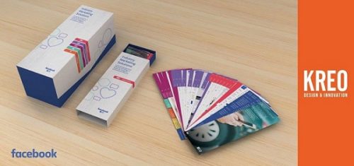
Given the stipulations, Kreo Design began the process by exploring many formats such as directory, pencil shaped book card formats and others. They finally developed a visually stunning and information rich swatch book directory crafted out of non-tearable paper. The guide opened like a hand-fan held together by a corner rivet. The interface design elements were such that each category was separated by page breakers with user-friendly coloured tabs for easy navigation, and the easy-to-read typography was chosen to best match the grid layout.
When it came down to packaging there were two scenarios to be considered: a single box to carry all five business verticals directories and a single box for a single business vertical directory. Beyond this, the packaging needed to be ergonomic, and easy to carry and use, convenient for frequent use, and also serve as a visually eye-catching protective cover. After thoughtful ideation, a magnet flap box was chosen over other styles of slide open and tab slide open for the five-box unit. In the case of the single unit box, a slide open style mechanism was picked over the flip open case and magnetic flap open options. As a result, Facebook gave kudos to Kreo for a job well done.


