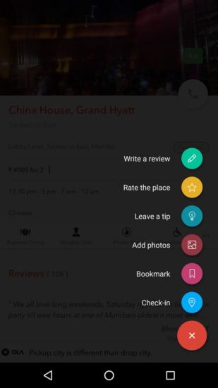
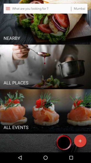
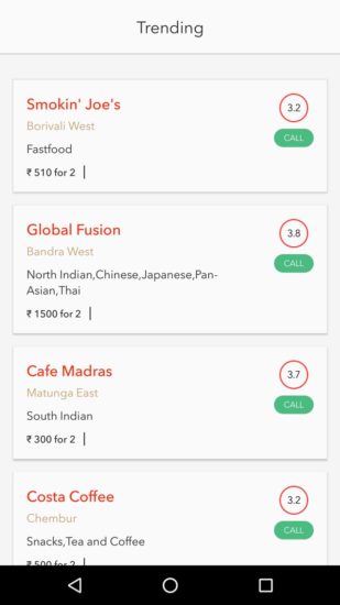
4th May 2016, India: Burrp! the pioneer in the Indian food discovery space released its new look today with exciting features. The all new app promises to create a seamless experience with a material design that has been inspired by Google’s recommendation to enhance their user’s experience.

The mobile and web application will now have new and regular offers from owners of restaurants around the user. Burrp! will send notifications to the customers through the application or message on various offers, if the user has registered for the ‘Offers’ section. With the events section, consumers can search for events happening at their favorite restaurants or restaurants recommended by Burrp! based on their preferences; food festivals, live performances and much more. The user also has the option to bookmark the event.

User preferences are a key aspect to a better experience and so sorting has been made easier with different options like food quality, service, ambiance and music genres at the restaurant. The feature is user-friendly and keeps in mind the kind of experience the user wants to have on that particular day.

While earlier the reviews were uncategorized, now the review summary will be differentiated into four main aspects – food, service, ambiance and music. The review summary will thus help new users choose to dine at a restaurant based on other user reviews.
Abhishek Chhajlani, Co-Business Head, Burrp! said, “This update is going to provide our app users with a massive UI/UX upgrade and will definitely catch the fancy of old and new users. Also, with every new update, we have a simple objective: Reduce the number of steps users needs to undertake to get to what they need. Addition of offers and events on the home screen is a step in that direction. We’re not looking at restaurant and food discovery in isolation, but as a culmination of everything the platform has to offer.”
The app currently is available on android and will soon be available on iOS.
Burrp dishes out new app design with engaging features


