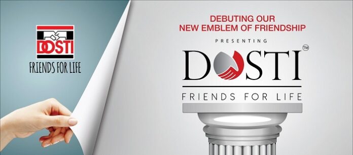
Dosti Realty Announces New Corporate Logo to Mark Achieving a 10 mn. Sq. Ft. Development Portfolio
Dosti Realty, a leading real estate group announces a new brand identity, by unveiling its new logo. In order to remain relevant, it is important for companies to evolve and the new logo completely reflects the corporate brand of the current millennial, its heritage, and the ability to imbibe a forward-thinking mindset.
Mumbai, July 23, 2020: Business Wire India, Dosti Realty, a leading real estate group announces a new brand identity, by unveiling its new logo. In order to remain relevant, it is important for companies to evolve and the new logo completely reflects the corporate brand of the current millennial, its heritage, and the ability to imbibe a forward-thinking mindset.
Dosti Realty has been in the real estate business for over 3 decades and delivered more than 117 properties to date, providing homes to over 8,600+ families for over 42,700 residents. Encompassing a portfolio of having delivered 10 mn. sq. ft. and currently constructing around 6 mn. sq. ft. across Mumbai and Thane, the company has vast experience in various development types, be it Residential, Retail, Commercial, Educational, and IT Park to name a few. Over the years, the brand has been revered for aesthetics, innovation, quality, timely delivery, trust and transparency, values that have built lasting relationships. To mark the momentous occasion of achieving a portfolio of 10 mn. sq. ft. and in order to lead the way for an evolving brand identity that will foray into different development avenues as well as cities, Dosti Realty has chosen to reveal a new logo identity. In order to keep up with the globally changing technologies, the company culture has been constantly evolving internally as it moves to a more automated driven set of processes. This transparent rebrand is a bold approach by Dosti Realty to renew, reset, and reshape its essence by focusing on enhancing its growth trajectory in the industry. The new logo is a recommitment to their mission of remaining laser-focused on their growth ambition in the market as well as emphasizing their customers who have been a part of this journey by leveraging on them in a way that makes the most sense for their business.
The hand of friendship continues to be a part on the logo but has evolved to suit modern times. The Dosti Realty new logo is a modernized version of the Handshake built within the Dosti Logo. Just as the logo evolves, so does the portfolio of the brand as it expands into different types of development. From luxury and mid-segment homes, commercial, IT, etc., it expands its portfolio into affordable, super luxury, schools, shopping centers/ malls, township developments etc. and will continue to push the benchmark with each passing year.
The logo is updated keeping the brand’s original colour palette red, white, and black in place. This will help people draw an association with the previous logo. The Alphabet ‘O’ in the new logo has been designed in the form of a handshake symbol which signifies the never-ending commitment of Dosti Realty’s friendship with its customers, stakeholders, vendors, and employees. The tag line of “Friends for Life” stays the same as Dosti Realty stays committed to its philosophy of building new relationships and trust through each new project.
Mr. Deepak Goradia – Vice Chairman and Managing Director, Dosti Realty says, “The new logo represents the company as a modern and evolving organization, fostering strong growth and driving innovation with a focus on sustainability. Everything about the company remains the same, we have just changed the logo to create a new identity as we are transforming our company culture along with expanding our portfolio. The entire process of re-designing the logo has been in the process of planning for a while and we are extremely happy to announce the launch of our new logo.
Dosti has always been known for transformation. It transformed Antop Hill Wadala to New Wadala a premier destination with the development of Dosti Acres. Dosti Realty was also one of the first developers in Mumbai to start the Society Club House Culture in its project Dosti Acres – New Wadala which offered world class amenities, facilities and even guest rooms. With Dosti Flamingos – Parel, given the view of the Harbour Sea and Flamingos, the project showcased a motif of Flamingos as a theme with several sculptures of Flamingos across the project which was another industry first in those days. Even the Thane skyline has been transformed with its large-scale developments like Dosti Vihar, Dosti Imperia etc. as well as Shil Thane with the large planned complex like Dosti Planet North and the Dosti Foundation School – the 1st ICSE school in that location.
This logo transformation also stands as a symbol of resilience of the company that has evolved and streamlined its processes further during the recent pandemic crisis. We look forward now to taking the brand Dosti Realty to even greater heights in the coming years.”


